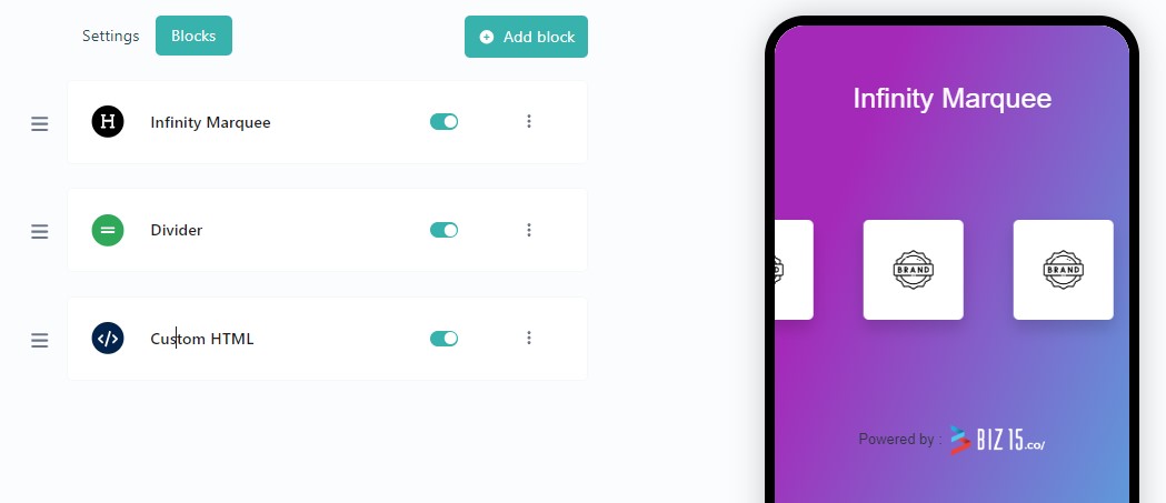
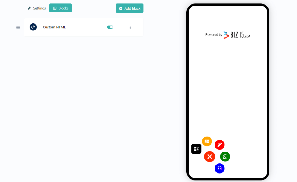
To integrate this Infinite Marqee Plugin into your biography page, please follow these installation instructions.
Step One: Insert a Custom HTML Block.
Step two: Just Paste below JS code into your Custom HTML block
<!-- JS CODE --><!-- Include the script for the infinity carousel -->
<script src="https://biz15.com/trialone/custom/js/infinity-carousel.js"></script>
<!-- Create an instance of the Infinity Carousel with specified options -->
<script>
// Instantiate the Infinity Carousel with your ID and configuration
new CreateInfinityCarousel("your-id", {
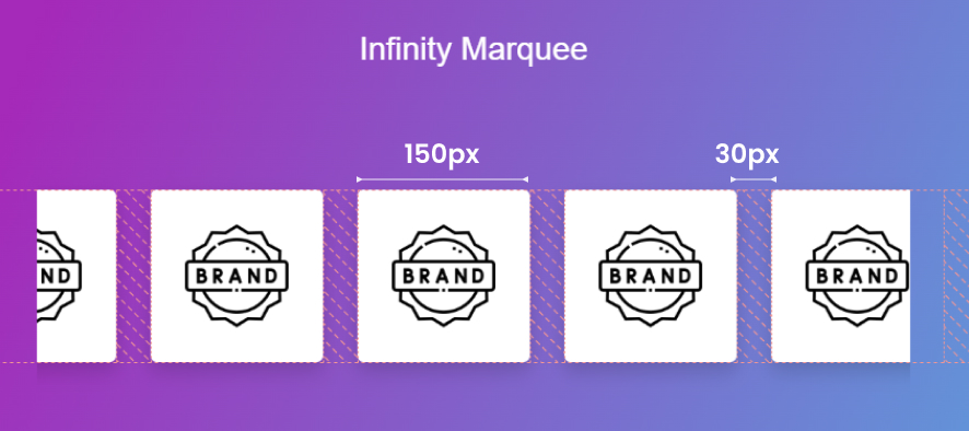
  // Size of each image in the carousel
  imageSize: "200px",
  // Gap between images
  imageGap: "50px",
  // Speed of the carousel animation
  speed: "10s",
// Array of image URLs for the carousel
image: [
"https://cdn-icons-png.flaticon.com/128/5486/5486264.png",
"https://cdn-icons-png.flaticon.com/128/5486/5486264.png",
"https://cdn-icons-png.flaticon.com/128/5486/5486264.png",
"https://cdn-icons-png.flaticon.com/128/5486/5486264.png",
"https://cdn-icons-png.flaticon.com/128/5486/5486264.png",
"https://cdn-icons-png.flaticon.com/128/5486/5486264.png",
"https://cdn-icons-png.flaticon.com/128/5486/5486264.png",
"https://cdn-icons-png.flaticon.com/128/5486/5486264.png",
"https://cdn-icons-png.flaticon.com/128/5486/5486264.png",
"https://cdn-icons-png.flaticon.com/128/5486/5486264.png",
],
});
</script>
// Size of each image in the carousel
imageSize: "200px",
// Gap between images
imageGap: "50px",
Set speed in infinite carousel
The following code shows how to set speed in infinite marquee
// Speed of the carousel animation
speed: "10s",
Add images in infinite carousel
The following code shows how to ad images in infinite marquee
    // Array of image URLs for the carousel
    image: [
        "yourimage.png",
        "yourimage.png",
        "yourimage.png",
        "yourimage.png",
        "yourimage.png",
        // Add more images separated by commas
    ],
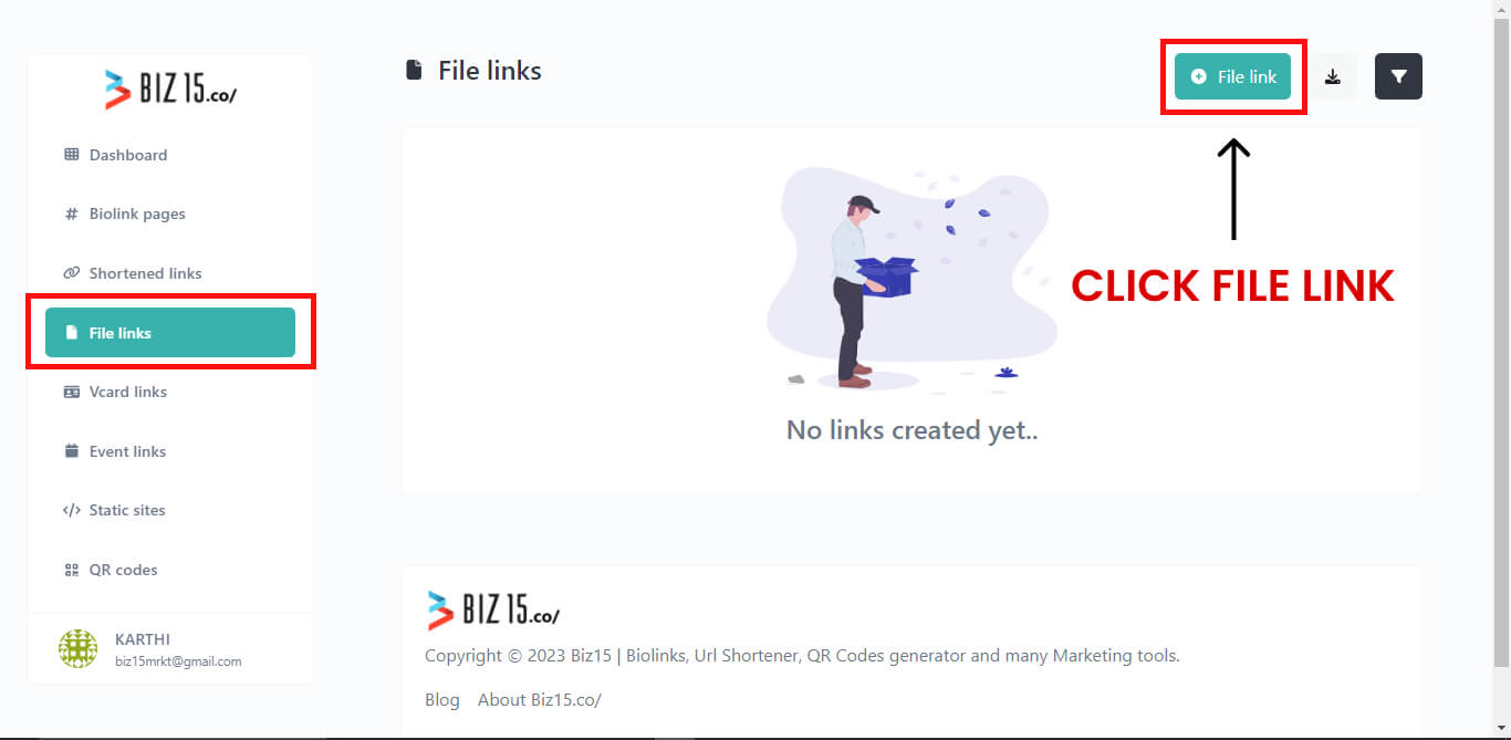
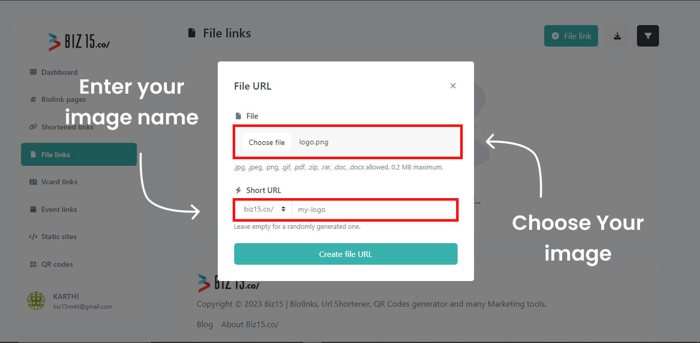
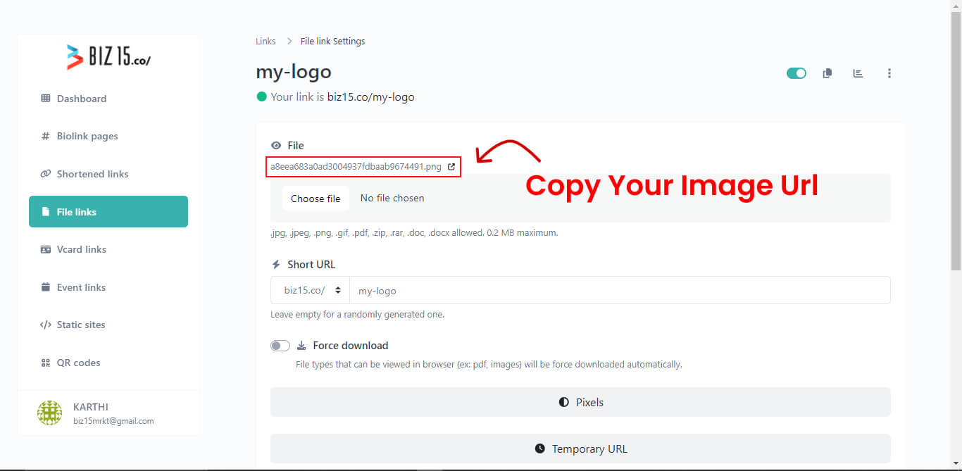
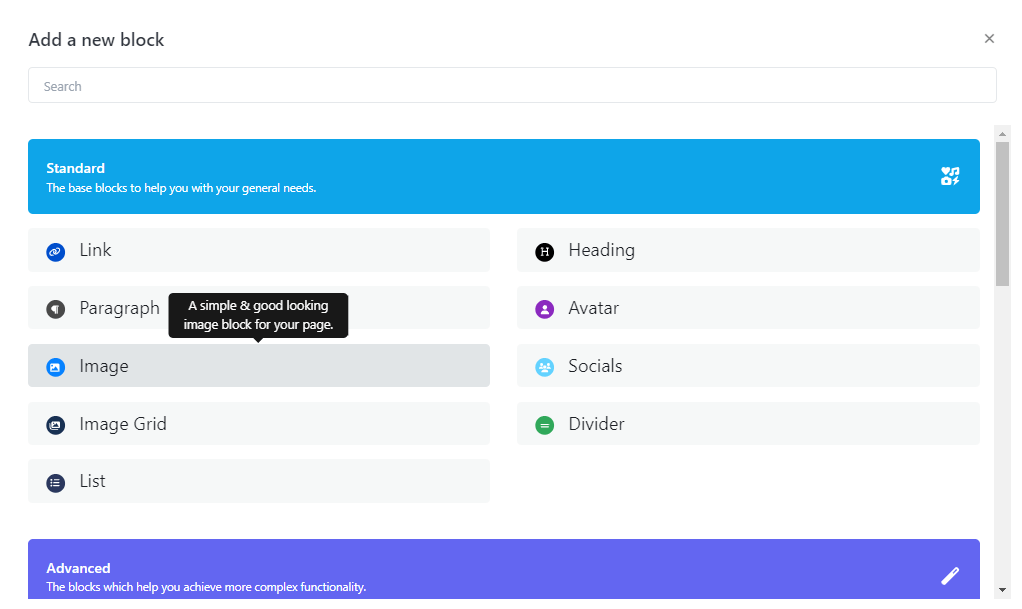
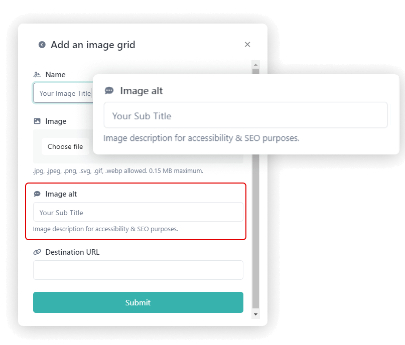
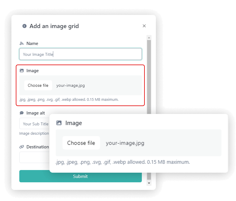
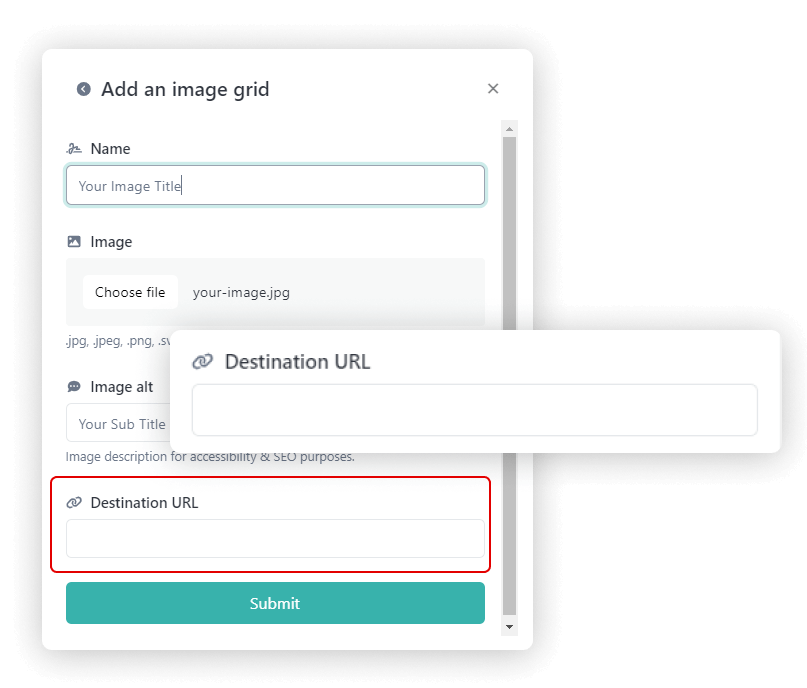
To upload an image and retrieve its source (URL), please follow these steps :
Select or Prepare Your Image: Begin by choosing the image you wish to upload, ensuring it’s in an appropriate format (e.g., JPG, PNG).
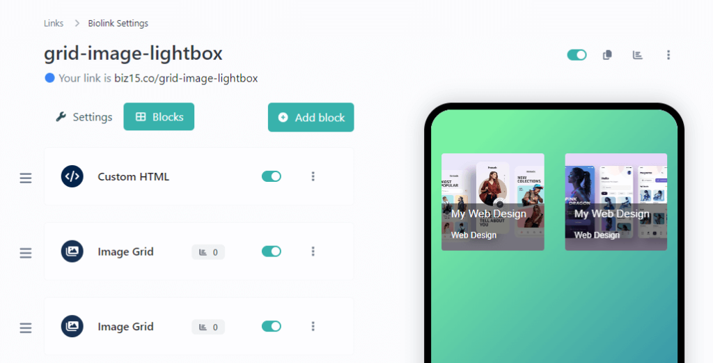
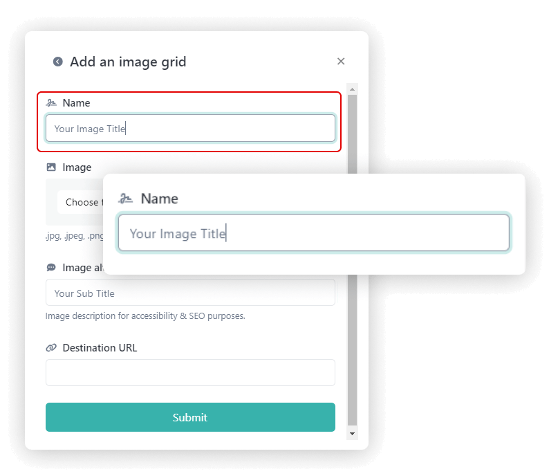
Step One : Insert an image block into your biography page.
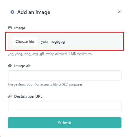
Step Two: Select your desired image and proceed by clicking the “Submit” button.
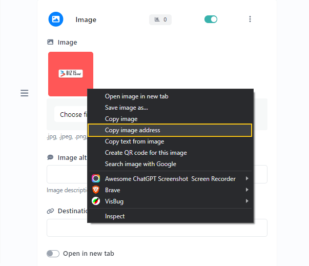
Step Three: Now, open your image block, right-click on the image, and select “Copy Image Address.”
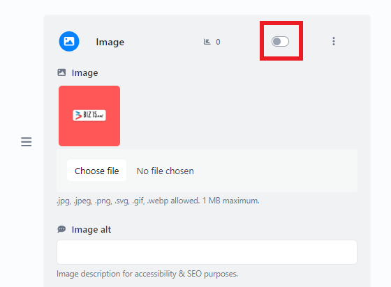
Step Four: Ensure that your image is not visible in the live view by disabling your status.
Here is an example of how you can use the image source (URL) in an HTML “img” tag:
<img src="https://biz15.co/yourImage.jpg" alt="Description of the Image">
Replace ‘https://biz15.co/yourImage.jpg’ with the actual URL you received during the image upload process.
“Follow the previously mentioned steps to upload and obtain the image URL for all of your images.”
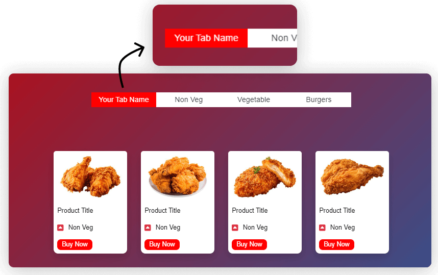
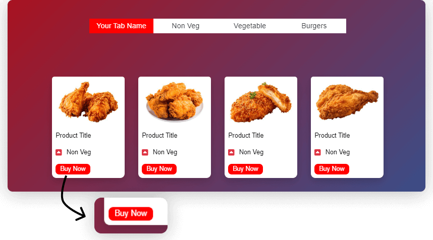
  //Here you can Set Tab name, as same as for all tabs
  tabName : "Your Tab Name",
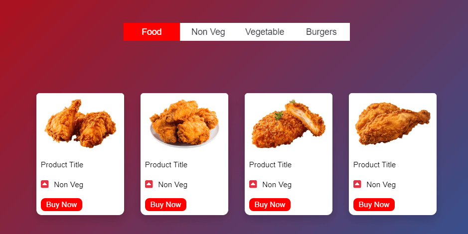
How to add Products in each Tabs
The following code shows how to add products as same as for all tabs
products : [
{
// Product details
productImageUrl : 'yourimage.png', // URL for the product image
productTitle: 'Product Title', // Title of the product
productTag : 'Product Tag', // Tag associated with the product// Button details
button : {
name : 'Buy Now', // Text on the button
link : ' # '// Link or action when the button is clicked
}
},
//separated by commas you can Add more products if needed
How to set button link for each products
The following code shows how to set button link for each products as same as for all tabs
button : {
name : 'Buy Now', // Text on the button
link : ' # '// Link or action when the button is clicked
}
To upload an image and retrieve its source (URL), please follow these steps :
Select or Prepare Your Image: Begin by choosing the image you wish to upload, ensuring it’s in an appropriate format (e.g., JPG, PNG).
Step One : Insert an image block into your biography page.
Step Two: Select your desired image and proceed by clicking the “Submit” button.
Step Three: Now, open your image block, right-click on the image, and select “Copy Image Address.”
Step Four: Ensure that your image is not visible in the live view by disabling your status.
Here is an example of how you can use the image source (URL) in an HTML “img” tag:
<img src="https://biz15.co/yourImage.jpg" alt="Description of the Image">
Replace ‘https://biz15.co/yourImage.jpg’ with the actual URL you received during the image upload process.
“Follow the previously mentioned steps to upload and obtain the image URL for all of your images.”
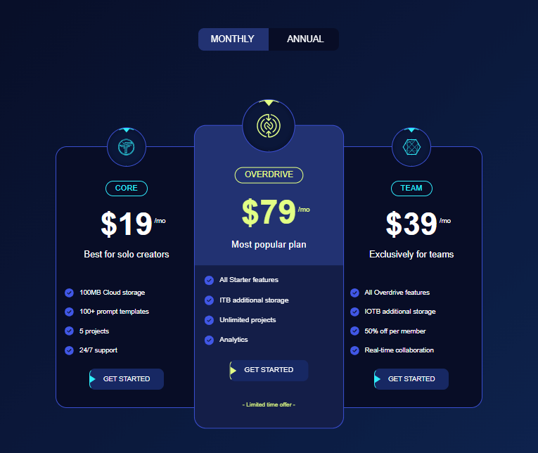
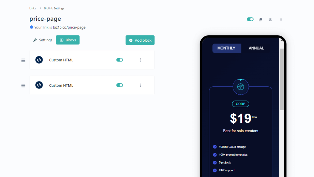
To integrate this Price section into your biography page, please follow these installation instructions.
Step One: Insert a Custom HTML Block.
Step two: Just Paste below JS code into your Custom HTML block
  // Define a configuration object for the price plugin
const pricePlugin = {
    // Switch between monthly and annual pricing
    Switch:  ["MONTHLY", "ANNUAL"],
    // Define background colors for different pricing box elements
    priceBoxBg:  'hsl(230, 66%, 9%)',
    priceCenterBoxBg:  'hsl(228, 54%, 29%)',
    priceBoxBorderColor:  'hsl(232, 61%, 52%)',
    priceBoxIconColor:  'hsl(184, 94%, 58%)',
    priceCenterBoxIconColor:  'hsl(74, 100%, 76%)',
    priceBoxFeatureIconColor:  'hsl(232, 77%, 58%)',
    priceCenterBoxFeatureIconColor:  'hsl(74, 100%, 76%)',

    // Define details for the left pricing box ("CORE")
    PriceBoxLeft: {
        // Icon for the left pricing box
        Icon: '<i class="fa-brands fa-trade-federation"></i>',
        // Title of the left pricing box
        Title: 'CORE',
        // Monthly and Annual prices for the left pricing box
        MonthlyPrice: ['$19', '/mo'],
        AnnualPrice: ['$49', '/an'],
        // Description of the left pricing box
        Description: 'Best for solo creators',
        // List of features for the left pricing box
        FeatureList: [
            "100MB Cloud storage",
            "100+ prompt templates",
            "5 projects",
            "24/7 support",
        ],
        // Icon for features in the left pricing box
        FeatureIcon: '<i class="fa-solid fa-circle-check"></i>',
        // Buttons for Monthly and Annual plans in the left pricing box
        Button: {
            Monthly: {
                Text: 'Get Started',
                Link: '#' // Placeholder link, replace with actual URL
            },
            Annual: {
                Text: 'Get Started',
                Link: '#' // Placeholder link, replace with actual URL
            }
        },
    },

    // Define details for the center pricing box ("OVERDRIVE")
    PriceBoxCenter: {
        // Icon for the center pricing box
        Icon: '<i class="fa-brands fa-nfc-directional"></i>',
        // Title of the center pricing box
        Title: 'OVERDRIVE',
        // Monthly and Annual prices for the center pricing box
        MonthlyPrice: ['$79', '/mo'],
        AnnualPrice: ['$199', '/an'],
        // Description of the center pricing box
        Description: 'Most popular plan',
        // List of features for the center pricing box
        FeatureList: [
            "All Starter features",
            "1TB additional storage",
            "Unlimited projects",
            "Analytics",
        ],
        // Icon for features in the center pricing box
        FeatureIcon: '<i class="fa-solid fa-circle-check"></i>',
        // Buttons for Monthly and Annual plans in the center pricing box
        Button: {
            Monthly: {
                Text: 'Get Started',
                Link: '#' // Placeholder link, replace with actual URL
            },
            Annual: {
                Text: 'Get Started',
                Link: '#' // Placeholder link, replace with actual URL
            }
        },
    },

    // Define details for the right pricing box ("TEAM")
    PriceBoxRight: {
        // Icon for the right pricing box
        Icon: '<i class="fa-brands fa-connectdevelop"></i>',
        // Title of the right pricing box
        Title: 'TEAM',
        // Monthly and Annual prices for the right pricing box
        MonthlyPrice: ['$39', '/mo'],
        AnnualPrice: ['$69', '/an'],
        // Description of the right pricing box
        Description: 'Exclusively for teams',
        // List of features for the right pricing box
        FeatureList: [
            "All Overdrive features",
            "1TB additional storage",
            "50% off per member",
            "Real-time collaboration",
        ],
        // Icon for features in the right pricing box
        FeatureIcon: '<i class="fa-solid fa-circle-check"></i>',
        // Buttons for Monthly and Annual plans in the right pricing box
        Button: {
            Monthly: {
                Text: 'Get Started',
                Link: '#' // Placeholder link, replace with actual URL
            },
            Annual: {
                Text: 'Get Started',
                Link: '#' // Placeholder link, replace with actual URL
            }
        },
    }
}

 // Link to an external JavaScript file for additional functionality
<script src="https://biz15.com/trialone/custom/js/price-plugin.js"></script>
How to set Price value for Monthly and Annual Plan
Create A Stunning Web Pages
    // Title of the right pricing box
    Title: 'TEAM',
    // Monthly and Annual prices for the right pricing box
    MonthlyPrice: ['$39', '/mo'],
    AnnualPrice: ['$69', '/an'],
How to set Separated button link for Monthly and Annual Plan
Here’s an example of how to give separated link for monthly and Annual: for each plan as same
    Button: {
      Monthly: {
          Text: 'Get Started',
          Link: '#' // Placeholder link, replace with actual URL
      },
      Annual: {
          Text: 'Get Started',
          Link: '#' // Placeholder link, replace with actual URL
      }
    },
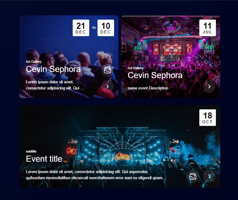
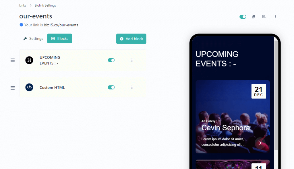
To integrate this Event Plugin into your biography page, please follow these installation instructions.
Step One: Insert a Custom HTML Block.
Step two: Just Paste below JS code into your Custom HTML block
  <script id="events-plugins">
// Define an array to store event data
const events = [
  {
      // Event Title
      eventTitle: '[Event Title]',
      // Subtitle or event type
      subTitle: '[Event Subtitle]',
      // Event description
      description: '[Event Description...]',
      // Event image source
      imageSrc: '[your-image.jpg]',
      // Array of related images
      relatedImageSrc: [
          {
              // Title for related image
              title: '[Event Title]',
              // Image source for related image
              img: '[your-image.jpg]',
              // Description for related image
              description: '[Event Description...].'
          },
          {
              // Title for another related image
              title: '[Event Title]',
              // Image source for another related image
              img: '[your-image.jpg]',
              // Description for another related image
              description: '[Event Description...].'
          },
      ],
      // Event date and time
      eventDate: {
          // Start time details
          startTime: {
              year: 2023,
              month: 12,
              day: 21,
              hours: 5,
              minutes: 30
          },
          // End time details
          endTime: {
              year: 2023,
              month: 12,
              day: 10,
              hours: 6,
              minutes: 30
          }
      },
      // Link for "know more" or event details
      knowMoreLink: 'your-link'
  },
  //To include any additional events by listing them separately, using commas to separate each event
];
</script>
<script src="https://biz15.com/trialone/custom/js/events-block.js"></script>
The following Code shows how to Set Event Start Date and End Date with Time
<script id="events-plugins">
const events = [
{
...
// Define an object to represent the eventDate, which includes start and end times.
eventDate: {
// Specify the start time of the event.
startTime: {
year: 2023, // Year when the event begins.
month: 12, // Month of the event start.
day: 21, // Day of the month for the event start.
hours: 5, // Hours part of the event start time.
minutes: 30// Minutes part of the event start time.
},
// Specify the end time of the event.
endTime: {
year: 2023, // Year when the event ends.
month: 12, // Month of the event end.
day: 21, // Day of the month for the event end (should match the start day).
hours: 6, // Hours part of the event end time.
minutes: 30// Minutes part of the event end time.
}
},
...
},
]
</script>
To upload an image and retrieve its source (URL), please follow these steps :
Select or Prepare Your Image: Begin by choosing the image you wish to upload, ensuring it’s in an appropriate format (e.g., JPG, PNG).
Step One : Insert an image block into your biography page.
Step Two: Select your desired image and proceed by clicking the “Submit” button.
Step Three: Now, open your image block, right-click on the image, and select “Copy Image Address.”
Step Four: Ensure that your image is not visible in the live view by disabling your status.
Here is an example of how you can use the image source (URL) in an HTML “img” tag:
<img src="https://biz15.co/yourImage.jpg" alt="Description of the Image">
Replace ‘https://biz15.co/yourImage.jpg’ with the actual URL you received during the image upload process.
“Follow the previously mentioned steps to upload and obtain the image URL for all of your images.”
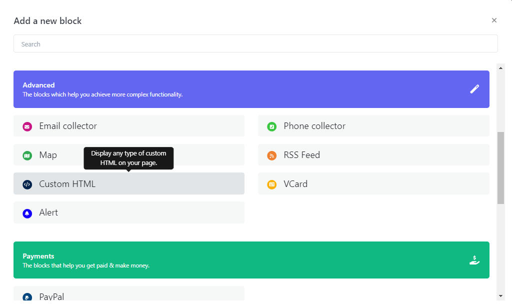
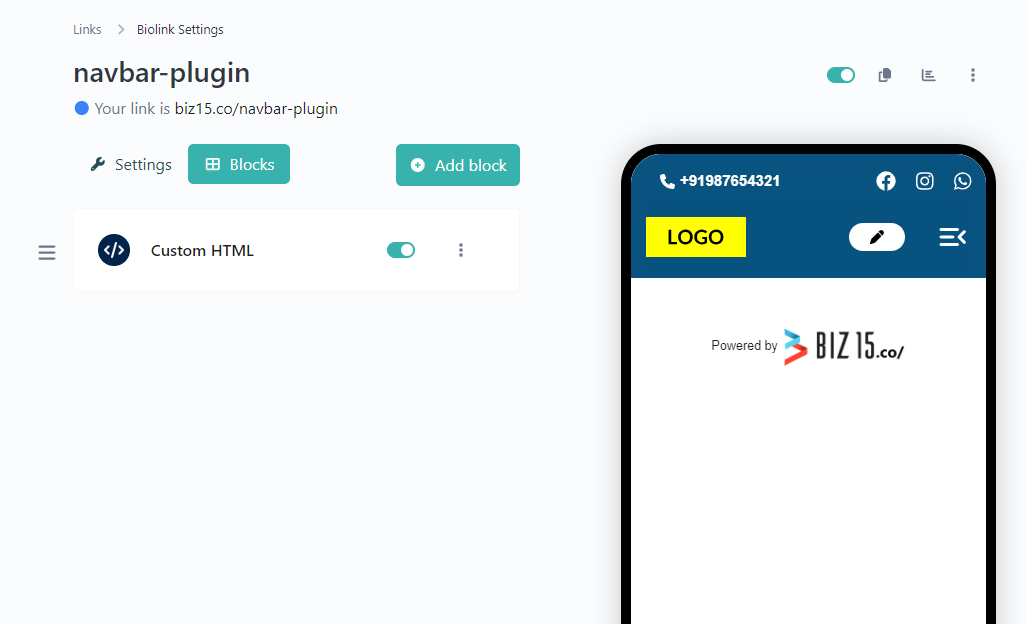
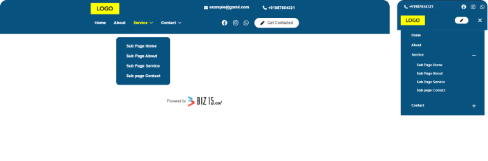
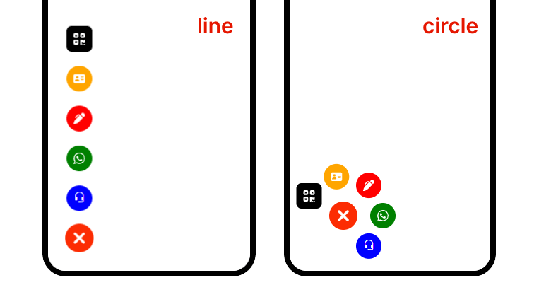
To integrate this Advance Menu Plugin into your biography page, please follow these installation instructions.
Step One: Insert a Custom HTML Block.
Step two: Paste the following code into your HTML block.
<script data-amp-id="amp" type="text/javascript">
// Define the style for the Advanced Bottom Menu (AMP)
const amp_style = "circle"; // Style can be "circle" and "line"// Define the position of the AMP
const amp_position = "left-bottom"; // Position options: "left-bottom", "right-bottom", "left-top", "left-top2", "right-top", "right-top2", and "center-bottom"// Define main icon background styles
const amp_main_icon = {
"main_background": "hsl(10, 98%, 50%)", // Background for main icons
"main_background_close": "hsl(10, 98%, 50%)" // Background for main icons when closed
};
// Define animation settings for the AMP
const amp_animation = {
"animation_name": "bounce", // Name of the available options: "pulse", "bounce", "beat", "fade", and "fade-beat"
"animation_color": "hsl(10, 98%, 50%)", // Color of the animation
"animation_range": 3, // Range of the animation
"animation_speed": 1000 // Speed of the animation in milliseconds
};
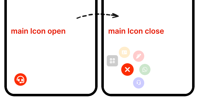
// Optional: Define the settings for the main font icons of the Advanced Bottom Menu (AMP)// (only Unicode example "main_icons_on_open_font": "F414")// if you don't want to use font icons, leave this as false
const amp_main_font_icon = {
"font_family": "FontAwesome",
"main_icons_on_open_font": "f590", // Show main icons when the menu is open
"main_icons_on_close_font": "f00d" // Show main icons when the menu is closed
};
// Define mini icons ordering and customization// Define an array of objects, each representing an icon
const icons_order = [
{
"order": 1, // Icon order (1st icon)
"name": "Call", // Icon name
"bg": "blue", // Background color
"font_icon_class": "bi bi-headset", // CSS class for the icon
"icon_font_color": "white", // Icon font color
"icon_font_size": "20px", // Icon font size// Array of attributes to set for the element
"set_attribute": [
{
"name": "href", // Attribute name
"value": "https://biz15.co/advance-bottom-menu#call-link" // Attribute value
}
]
},
{
"order": 2, // Icon order (2nd icon)
"name": "Whatsapp", // Icon name
"bg": "green", // Background color
"font_icon_class": "fa-brands fa-whatsapp", // CSS class for the icon
"icon_font_color": "white", // Icon font color
"icon_font_size": "20px", // Icon font size// Array of attributes to set for the element
"set_attribute": [
{
"name": "href", // Attribute name
"value": "https://biz15.co/advance-bottom-menu#whatsapp-link" // Attribute value
}
]
},
{
"order": 3, // Icon order (3rd icon)
"name": "Form", // Icon name
"bg": "red", // Background color
"font_icon_class": "fa-solid fa-pen-clip", // CSS class for the icon
"icon_font_color": "white", // Icon font color
"icon_font_size": "20px", // Icon font size// Array of attributes to set for the element
"set_attribute": [
{
"name": "href", // Attribute name
"value": "https://biz15.co/advance-bottom-menu#form" // Attribute value
},
{
"name": "id", // Attribute name
"value": "form_id" // Attribute value
},
{
"name": "data-form-open", // Attribute name
"value": "https://example.com/" // Attribute value
}
]
},
{
"order": 4, // Icon order (4th icon)
"name": "V-Card", // Icon name
"bg": "orange", // Background color
"font_icon_class": "fa-solid fa-address-card", // CSS class for the icon
"icon_font_color": "white", // Icon font color
"icon_font_size": "20px", // Icon font size// Array of attributes to set for the element
"set_attribute": [
{
"name": "href", // Attribute name
"value": "https://biz15.co/advance-bottom-menu#v_card" // Attribute value
}
]
},
{
"order": 5, // Icon order (5th icon)
"name": "QR Code", // Icon name
"bg": "black", // Background color
"font_icon_class": "fa-solid fa-qrcode", // CSS class for the icon
"icon_font_color": "white", // Icon font color
"icon_font_size": "20px", // Icon font size
"border_radius": "20%", // Border radius for styling// Array of attributes to set for the element
"set_attribute": [
{
"name": "href", // Attribute name
"value": "https://biz15.co/advance-bottom-menu#qr_code" // Attribute value
},
{
"name": "data-open-qr-code", // Attribute name
"value": "https://upload.wikimedia.org/wikipedia/commons/thumb/d/d0/QR_code_for_mobile_English_Wikipedia.svg/1200px-QR_code_for_mobile_English_Wikipedia.svg.png" // Attribute value
}
]
}
];
// Function to load the AMP script dynamically
function biz_bottom_menu(d) {
let s = d.createElement("script");
s.src = "https://biz15.com/trialone/advance-bottom-menu/advance-bottom-menu/script.js";
s.async = true;
d.body.append(s);
}
// Call the function to load the AMP script
biz_bottom_menu(document);
</script>
  <script data-amp-id="amp" type="text/javascript">
    // Define the style for the Advanced Bottom Menu (AMP)
    const amp_style = "circle";  // Style can be "circle" and "line"
    .....
    .....
  </script>
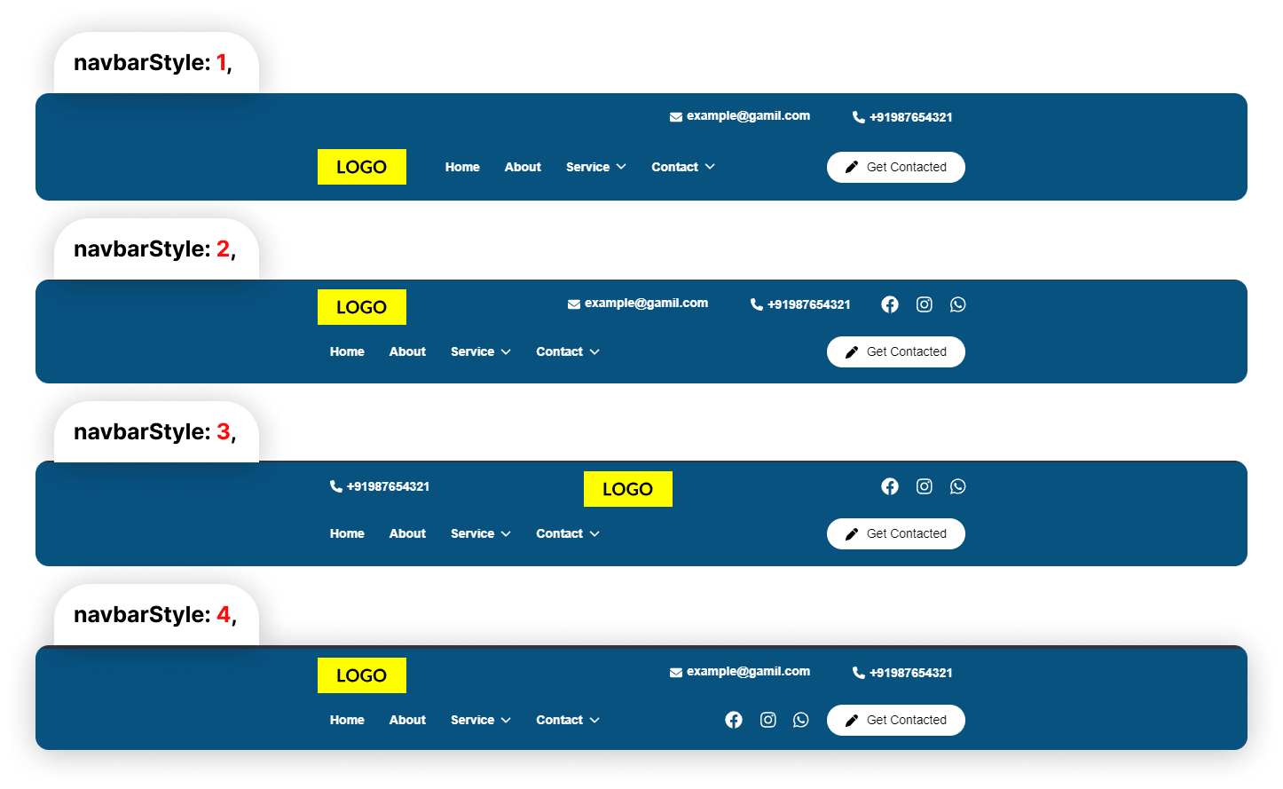
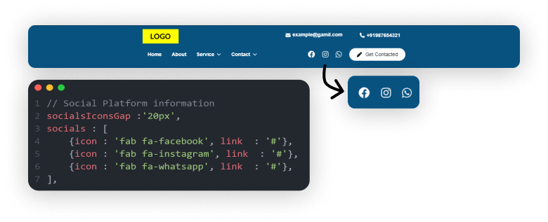
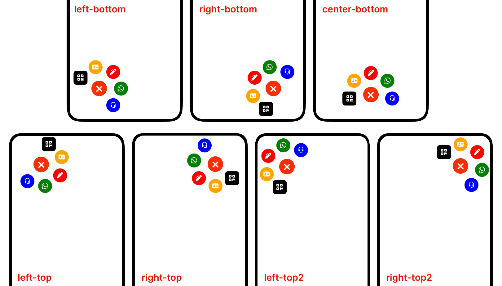
How to set Main Icon Position :
Below code that allows for set Advance Menu Position.
  <script data-amp-id="amp" type="text/javascript">
  // Define the position of the AMP
    const amp_position = "left-bottom";  // Position options: "left-bottom", "right-bottom", "left-top", "left-top2", "right-top" ,"right-top2" and "center-bottom",
    .....
    .....
  </script>
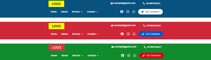
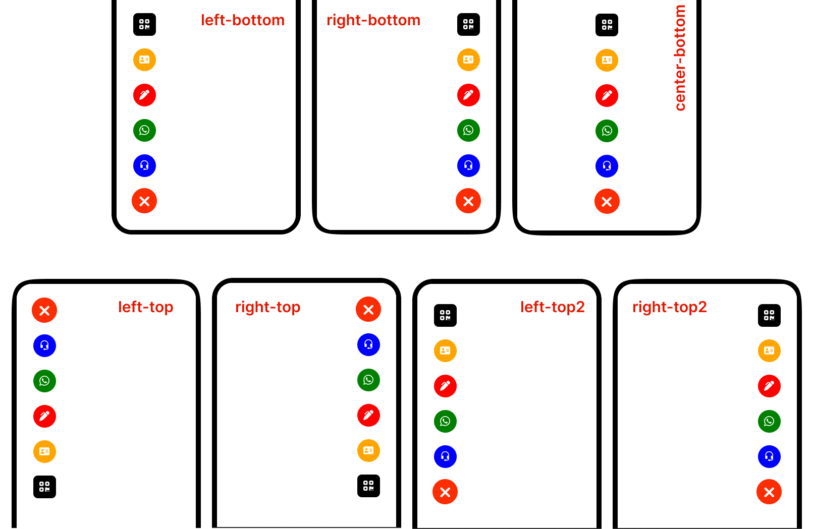
Here an preview for Positions with style “circle”
Here an preview for Positions with style “line”
How to Customize Mini icon:
Below code that allows for Customize Advance Menu Main icon.
  <script data-amp-id="amp" type="text/javascript">
  // main icon bg
     const amp_main_icon = {
         "main_background": "hsl(10, 98%, 50%)",  // Background for main icons
         "main_background_close": "hsl(10, 98%, 50%)",  // Background for main icons when closed
     }
     // Define animation settings for the AMP
     const amp_animation = {
         "animation_name": "bounce",  // Name of the available option : "pulse", "bounce", "beat", "fade" and "fade-beat"
         "animation_color": "hsl(10, 98%, 50%)",  // Color of the animation
         "animation_range": 3,  // Range of the animation
         "animation_speed": 1000  // Speed of the animation in milliseconds
     };
       // Optional : Define the settings for the main font icons of the Advanced Bottom Menu (AMP)
       // (only Unicode example "main_icons_on_open_font" : "F414" )
       // if you don't want leave this false
       const amp_main_font_icon = {
           "font_family" : "FontAwesome",
           "main_icons_on_open_font": "f590",  // Show main icons when the menu is open
           "main_icons_on_close_font": "f00d"  // Show main icons when the menu is closed
       };
     .....
     .....
   </script>
How to Customize Main icon:
Below code that allows for Customize Advance Menu Mini icon.
  <script data-amp-id="amp" type="text/javascript">
  // mini icons ordering and customization
        // Define an array of objects, each representing an icon
        const icons_order = [
          {
              "order": 1,  // Icon order (1st icon)
              "name": "Call",  // Icon name
              "bg": "blue",  // Background color
              "font_icon_class": "bi bi-headset",  // CSS class for the icon
              "icon_font_color": "white",  // Icon font color
              "icon_font_size": "20px",  // Icon font size

              // Array of attributes to set for the element
              "set_attribute": [
                  {
                      "name": "href",  // Attribute name
                      "value": "https://biz15.co/advance-bottom-menu#call-link"  // Attribute value
                  }
              ]
          },
          {
              "order": 2,  // Icon order (2nd icon)
              "name": "Whatsapp",  // Icon name
              "bg": "green",  // Background color
              "font_icon_class": "fa-brands fa-whatsapp",  // CSS class for the icon
              "icon_font_color": "white",  // Icon font color
              "icon_font_size": "20px",  // Icon font size

              // Array of attributes to set for the element
              "set_attribute": [
                  {
                      "name": "href",  // Attribute name
                      "value": "https://biz15.co/advance-bottom-menu#whatsapp-link"  // Attribute value
                  }
              ]
          },
          {
              "order": 3,  // Icon order (3rd icon)
              "name": "Form",  // Icon name
              "bg": "red",  // Background color
              "font_icon_class": "fa-solid fa-pen-clip",  // CSS class for the icon
              "icon_font_color": "white",  // Icon font color
              "icon_font_size": "20px",  // Icon font size

              // Array of attributes to set for the element
              "set_attribute": [
                  {
                      "name": "href",  // Attribute name
                      "value": "https://biz15.co/advance-bottom-menu#form"  // Attribute value
                  },
                  {
                      "name": "id",  // Attribute name
                      "value": "form_id"  // Attribute value
                  },
                  {
                      "name": "data-form-open",  // Attribute name
                      "value": "https://example.com/"  // Attribute value
                  }
              ]
          },
          {
              "order": 4,  // Icon order (4th icon)
              "name": "V-Card",  // Icon name
              "bg": "orange",  // Background color
              "font_icon_class": "fa-solid fa-address-card",  // CSS class for the icon
              "icon_font_color": "white",  // Icon font color
              "icon_font_size": "20px",  // Icon font size

              // Array of attributes to set for the element
              "set_attribute": [
                  {
                      "name": "href",  // Attribute name
                      "value": "https://biz15.co/advance-bottom-menu#v_card"  // Attribute value
                  }
              ]
          },
          {
              "order": 5,  // Icon order (5th icon)
              "name": "QR Code",  // Icon name
              "bg": "black",  // Background color
              "font_icon_class": "fa-solid fa-qrcode",  // CSS class for the icon
              "icon_font_color": "white",  // Icon font color
              "icon_font_size": "20px",  // Icon font size
              "border_radius": "20%",  // Border radius for styling

              // Array of attributes to set for the element
              "set_attribute": [
                  {
                      "name": "href",  // Attribute name
                      "value": "https://biz15.co/advance-bottom-menu#qr_code"  // Attribute value
                  },
                  {
                      "name": "data-open-qr-code",  // Attribute name
                      "value": "https://upload.wikimedia.org/wikipedia/commons/thumb/d/d0/QR_code_for_mobile_English_Wikipedia.svg/1200px-QR_code_for_mobile_English_Wikipedia.svg.png"  // Attribute value
                  }
              ]
          }
      ];
      .....
      .....
    </script>
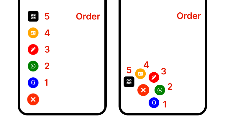
How to set order of each mini icons:
Below code that allows to set order of mini icons. note : order value should be between “1” to “5”
"order": 1, // Icon order (1st icon)
Here an preview for order of mini icon
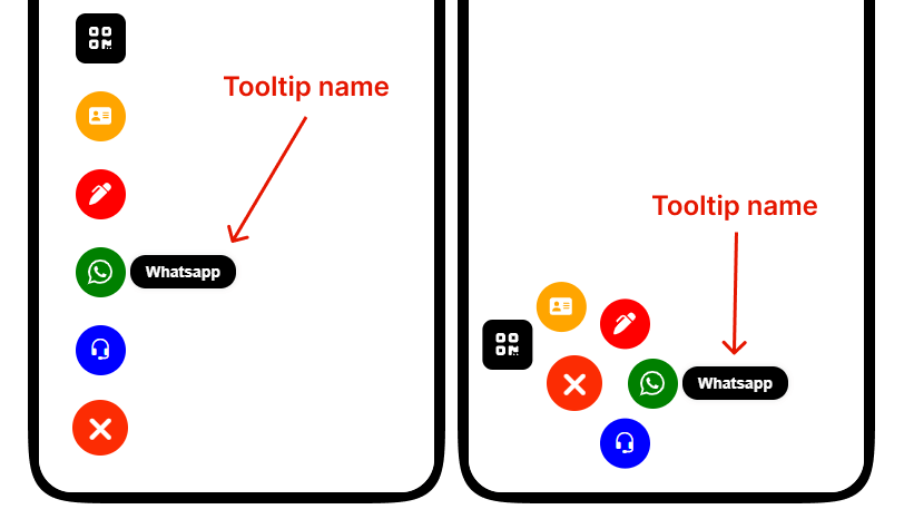
How to set tooltip name:
Below code that allows to set tooltip name for each mini icons
"name": "Whatsapp", // Icon name for Tooltip
Here an preview for how tooltip name appear on website.
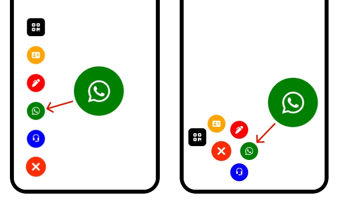
How to set mini icons Background Color and its Font icon:
Below code that allows to set mini icon Background Color and its Font icon with color and size
    "bg": "green",  // Background color
    "font_icon_class": "fa-brands fa-whatsapp",  // CSS class for the icon
    "icon_font_color": "white",  // Icon font color
    "icon_font_size": "20px",  // Icon font size
Here an preview for how mini icon appear on website
How to set link for mini icon:
Below code that allows to set link for mini icon
  // Array of attributes to set for the element
  "set_attribute": [
      {
          "name": "href",  // Attribute name
          "value": "https://biz15.co/advance-bottom-menu#whatsapp-link"  // Attribute value
      }
  ]
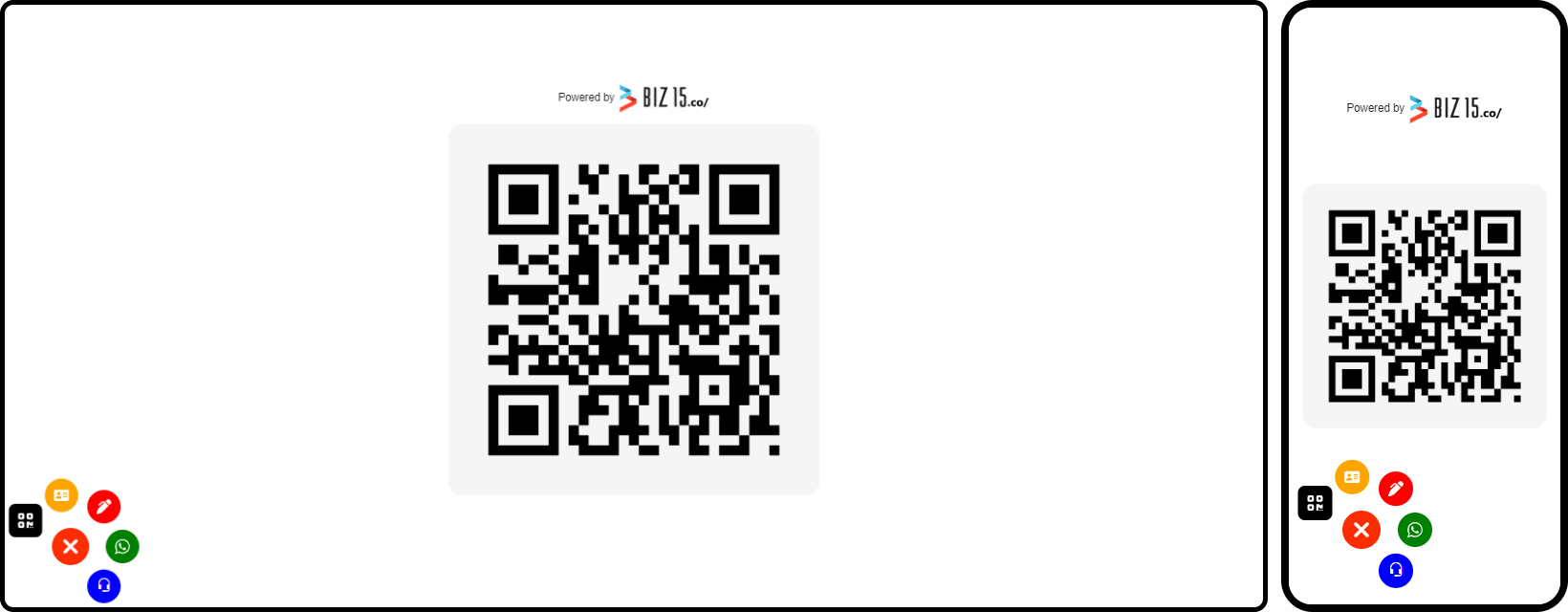
How to set Qr code image:
Below code you must provide the qr code imag url in that “data-open-qr-code” attribute
  // Array of attributes to set for the element
    "set_attribute": [
        {
          "name": "href",  // Attribute name
          "value": "https://biz15.co/advance-bottom-menu#qr-code-line"  // Attribute value
        },
        {
          "name": "data-open-qr-code",  // this line for qr code popup
          "value": "your-qr-code-image.png"  // qr code image url you want to popup
        }
    ]
Here’s an example of how to set in code
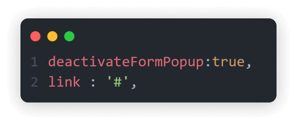
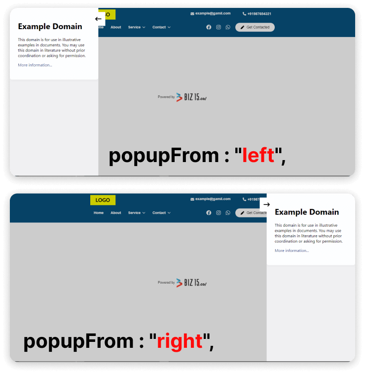
How to set Popup Form:
Below code you must provide the form url in that “data-form-open” attribute
Here’s an example of how to set popup form url
  // Array of attributes to set for the element
    "set_attribute": [
      {
        "name": "data-form-open",  // Attribute name
        "value": "https://example.com/"  // Attribute value
      }
    ]
Here an preview for how popup form appear on website
To upload an image and retrieve its source (URL), please follow these steps :
Select or Prepare Your Image: Begin by choosing the image you wish to upload, ensuring it’s in an appropriate format (e.g., JPG, PNG).
Step One : Insert an image block into your biography page.
Step Two: Select your desired image and proceed by clicking the “Submit” button.
Step Three: Now, open your image block, right-click on the image, and select “Copy Image Address.”
Step Four: Ensure that your image is not visible in the live view by disabling your status.
Here is an example of how you can use the image source (URL) in an HTML “img” tag:
<img src="https://biz15.co/yourImage.jpg" alt="Description of the Image">
Replace ‘https://biz15.co/yourImage.jpg’ with the actual URL you received during the image upload process.
“Follow the previously mentioned steps to upload and obtain the image URL for all of your images.”
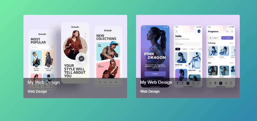
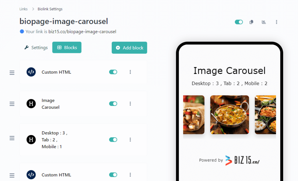
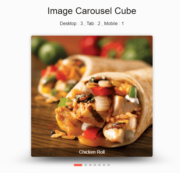
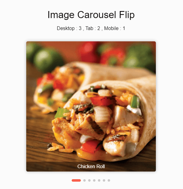
To integrate this Image slider or carousel into your biography page, please follow these installation instructions.
Step One: Insert a Custom HTML Block.
Step two: Paste the following code into your HTML block.
<script>
// Create a new instance of the SwiperSlides class
new SwiperSlides('your-unique-slier-id', {
// Slider configuration options
name: 'your-unique-slider-name',
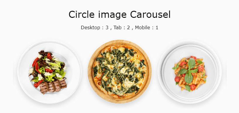
type: 'circle',
hoverEffect: 'zoom-out',
title: {
// Title appearance and styling options
titleAppearance: false, // Disable title appearance
titleLocation: 'bottom', // Set title location to the bottom
titleColor: 'black', // Set title color to black
titleSize: '16px', // Set title font size to 16px
titleBgColor: 'rgba(0, 0, 0, 0.4)' // Set title background color with opacity
},
pagination: {
// Pagination options
active: false, // Disable pagination
type: 'line', // Set pagination type to line
color: '[your-color]' // Set pagination color
},
imgs: [
// Image data for the slider
{
title: 'Image Title', // Set image title
img: '[your-image-url]' // Set image URL
},
{
title: 'Image Title',
img: '[your-image-url]'
},
// Add more image data objects as needed
],
slidesPerView: {
// Slides per view configuration for different screen sizes
mobile: {
slides: 2, // Set the number of slides on mobile
spaceBetween: 20// Set space between slides
},
tab: {
slides: 2, // Set the number of slides on tablet
spaceBetween: 20// Set space between slides
},
desktop: {
slides: 3, // Set the number of slides on desktop
spaceBetween: 20// Set space between slides
}
},
loop: true, // Enable loop to create a circular effect
autoplayBetweenTime: 2500, // Autoplay interval in milliseconds
centeredSlides: true, // Center slides
reverseDirection: false// Do not reverse slide direction
});
</script>
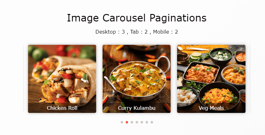
You have the option to add pagination of your image carousel.
    new SwiperSlides('your-unique-slier-id', {
      ......
      pagination: {
        // Pagination options
        active: true, // Active pagination
        type: 'dots', // Set pagination type options "dots" , "line" and "number"
        color: '[your-color]' // Set pagination color
      },
      ......
    });
If you need line pagination, you can implement it using the following code:
    new SwiperSlides('your-unique-slier-id', {
      ......
      pagination: {
        // Pagination options
        active: true, // Active pagination
        type: 'line', // Set pagination type options "dots" , "line" and "number"
        color: '[your-color]' // Set pagination color
      },
      ......
  });
If you need number pagination, you can implement it using the following code:
    new SwiperSlides('your-unique-slier-id', {
      ......
      pagination: {
        // Pagination options
        active: true, // Active pagination
        type: 'number', // Set pagination type options "dots" , "line" and "number"
        color: '[your-color]' // Set pagination color
      },
      ......
    });

